End-to-end redesign of a 200-member BJJ gym's website. Started with a 72.5% bounce rate and no mobile experience. Left with a 40% lift in trial signups and a site the owner can maintain himself.
View Live Site →Overview
A 200-member gym with a website that was driving people away
Fox Fitness had the members, the programs, and the coaches. Their website just wasn't showing any of it — especially on a phone.
The problem in plain terms
72.5% of visitors were leaving immediately. The mobile experience was broken — menus didn't work on iOS Safari, text required constant zooming, and no one could find the schedule or pricing without calling the gym directly.
Prospective members were showing up, getting frustrated, and leaving. The owner had no idea how bad it was until we ran through the site together on a phone.
Constraints I was working with
- Zero budget — Wix premium only (~$300/yr). No custom dev
- Owner maintainability — had to be updatable without a developer post-launch
- 6 weeks — volunteer project with a hard deadline
- Single decision-maker — owner had final say on everything
- Platform ceiling — some interactions simply weren't possible in Wix
How do you create a mobile-first, maintainable website that increases qualified trial signups — with transparent pricing, a dynamic schedule, and zero ongoing developer cost?
What I prioritized
Primary objectives
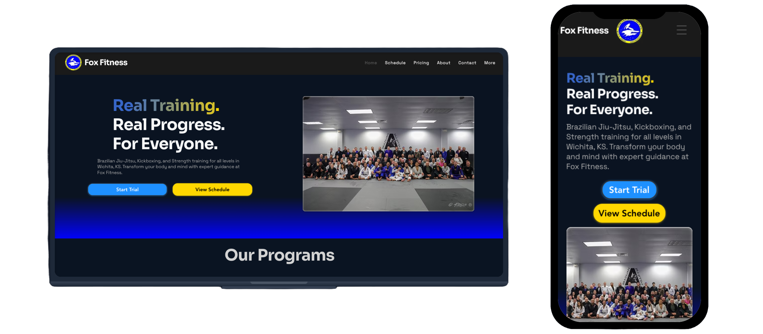
- Fully responsive, mobile-first experience — address the 72.5% bounce rate
- Increase trial signups through a cleaner conversion path and transparent pricing
Secondary objectives
- Improve schedule accessibility for current members and parents with kids in multiple programs
- Balance design quality with Wix constraints so the owner could maintain it independently
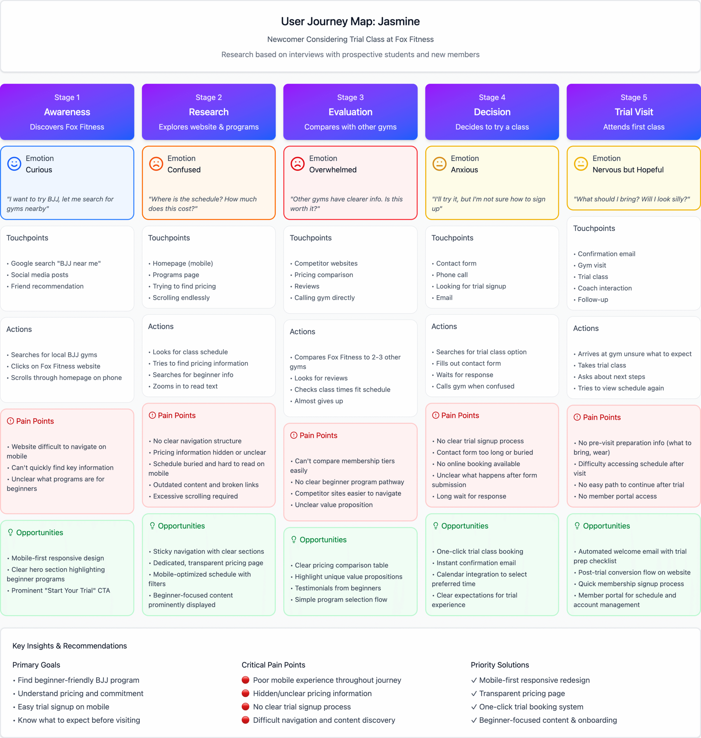
Research
10 interviews before writing a single line of code
Talked to current members, parents, and prospective students. The same three problems came up in almost every conversation.
10 semi-structured interviews, 15 minutes each. 6 current members, 2 parents of youth students, 2 prospective members who hadn't joined yet. Ages 22–68, tech-savviness ranging from "comfortable with social media" to "not really."
The three problems that kept coming up
1. Mobile was completely broken — 9/10 users
The site was unusable on a phone. Navigation didn't work on mobile Safari. Text required constant zoom. Most users had stopped visiting the site on their phones entirely and were calling the gym instead when they needed information.
"I stopped checking the website on my phone entirely. The text is so small I'd have to pinch and zoom on every section, and half the time the menu doesn't even work. I just call the gym now if I need to know something."
2. Schedule was buried and outdated — 8/10 users
Schedule lived in downloadable PDF files. No mobile-friendly view. Frequently outdated — still showing a previous instructor's info. Parents with kids in multiple programs had to scroll through separate image files for each program and still weren't sure if they were looking at the current schedule.
"My kids are in different programs, so I need to see the full week at a glance. The old site made me scroll through these huge image files for each program separately. It took forever and half the time the schedule was outdated anyway."
3. No pricing anywhere — 7/10 users
Nothing on the site about cost. Required a phone call or in-person visit to find out. One prospective student visited the site three separate times over two weeks and almost didn't come in because she assumed it must be expensive if they were hiding it.
"I looked at the site three different times before I finally came in for a trial. I kept searching for pricing and couldn't find it anywhere. I honestly assumed it was going to be really expensive if they were hiding it, so I almost didn't come."
Competitive landscape
Analyzed 5 local BJJ gym websites to find where Fox Fitness could differentiate.
| Competitor | Mobile | Pricing | Schedule | Trial CTA |
|---|---|---|---|---|
| Wichita Jiujitsu Club | Minimal, basic theme | None | Email for schedule | Email only |
| 316 Martial Arts | Squarespace, moderate | None | Static, on homepage | Contact form |
| Genesis Health Clubs | Corporate, responsive | Full gym only | Listed on program page | Free week prominent |
| Valor BJJ | Wix, fully optimized | Free week offer | Full schedule page | Book consultation |
| Burns Martial Arts | Wix, responsive | None | Contact for schedule | Free class, email |
None of the local competitors showed transparent pricing. Valor BJJ had the best mobile experience but still no pricing. By combining transparent pricing + excellent mobile UX + dynamic schedule filtering, Fox Fitness could differentiate where every local competitor had dropped the ball.
Analytics baseline
Traffic & engagement
- Bounce rate: 72.5% (industry avg 55–65%)
- Avg session: 17 sec on homepage, 45 sec on schedule
- Pages per session: 1.5 — minimal exploration
- Monthly sessions: 486 avg
Conversion signals
- Phone CTR: 0.27% — almost nobody clicking to call
- Trial signups: ~10/mo (owner-tracked, not analytics)
- Traffic sources: 65% direct, 25% organic, 10% social
- Mobile usage: High, but high abandonment
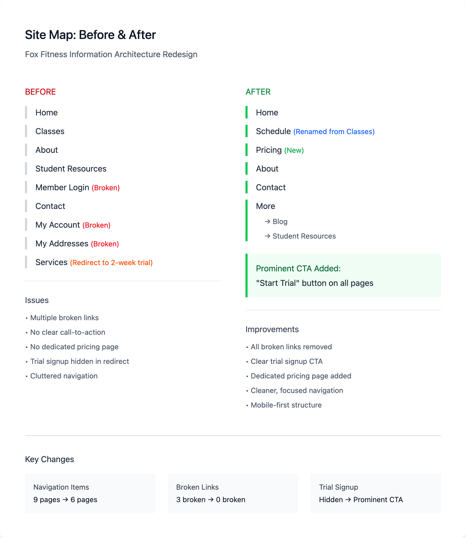
Key Decisions
What shipped, what got cut, and why
Prioritized with RICE scoring. These are the calls that shaped the final product.
RICE prioritization
| Feature | Reach | Impact | Confidence | Effort (hrs) | Score | Decision |
|---|---|---|---|---|---|---|
| Mobile-responsive design | 200 users | 3 – massive | 95% | 12 | 47.5 | SHIP |
| Transparent pricing page | 150 prospects/mo | 3 – massive | 90% | 3 | 135 | SHIP |
| Unified schedule + filters | 180 users | 3 – massive | 85% | 6 | 76.5 | SHIP |
| Simplified trial form | 30 trials/mo | 2 – high | 80% | 2 | 24 | SHIP |
| Online class booking | 100 users | 2 – high | 40% | 15 | 5.3 | CUT |
| Member portal / login | 200 users | 1 – low | 30% | 20 | 3 | CUT |
| SMS reminder system | 200 users | 1 – low | 50% | 8 | 12.5 | CUT |
| Community forum | 50 users | 1 – low | 20% | 25 | 0.4 | CUT |
Why each feature got cut
Online class booking
Only 2 of 10 interview participants mentioned wanting it. Would need custom dev beyond Wix's capabilities, and a third-party integration runs $50/month — not ROI-positive for a 200-member gym. Owner uses a paper sign-in; members prefer the flexibility of drop-in.
Member portal / login
One user mentioned wanting to check billing history online. The gym already manages billing through Zen Planner — building a portal would create sync issues and double the maintenance burden. Not worth it for minimal demand.
SMS reminder system
The owner already sends a weekly group text manually — takes 5 minutes. A third-party SMS integration costs $49/month ($588/year) with minimal time savings at this scale. Revisit if membership hits 500+.
Community forum
The gym already has an active Facebook group with 180 members. Building a forum would fragment that community, require moderation, and need content seeding with no clear upside over what already exists.
The stakeholder disagreement that almost derailed things
Owner's position
Wanted separate schedule pages for each program — Kids BJJ, Adult BJJ, No-Gi, Competition Team.
"New visitors get overwhelmed by too much information. If someone's interested in kids' classes, they don't care about the competition schedule."
My position (from research)
8 of 10 participants wanted to "see everything at once" — especially parents with kids in multiple programs and members who cross-train between gi/no-gi.
A unified schedule with filters would also cut maintenance time significantly.
Built two Figma versions — split schedules vs. unified with filters — and tested them with 3 actual gym members. All three preferred the unified view: "I can just see what I need without clicking around."
Also ran the math: the owner was spending ~30 minutes/week updating 4 separate schedule PDFs. A unified HTML schedule would take ~5 minutes once. That's 20+ hours saved per year — and it closed the argument.
Design feedback changes
Trial CTA prominence
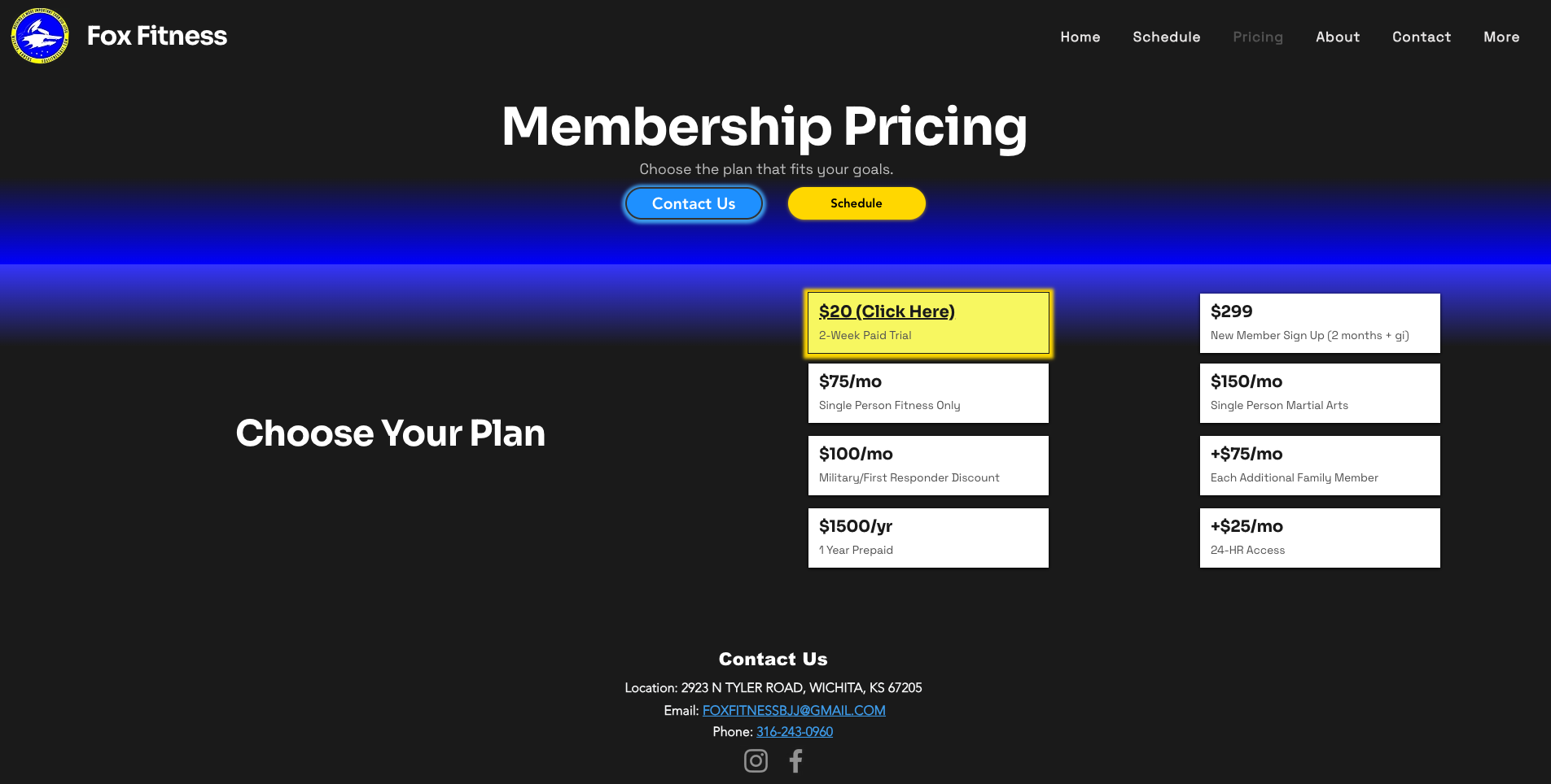
Initial button blended with surrounding content. Made it high-contrast with a sticky "Start Free Trial" in the mobile nav.
Pricing in nav
Participants expected pricing under the main nav, not buried in "About." Added it as a top-level nav item — that's where people look first.
Filter button clarity
Schedule filter buttons looked like labels, not interactive controls. Added hover states and clear active styling so they obviously did something.
Results
Six weeks post-launch — every primary objective hit
Tracked from launch on October 15, 2025 through November 30, 2025.
How the revenue math works
+4 additional trials/month × 60% trial-to-paid conversion × $150/month membership = +$360 monthly recurring revenue = +$4,320 per year.
Project cost: $300 (Wix subscription) + $0 labor (volunteer). That's a 14.4× return on platform cost. Even valuing design time at $50/hr (30 hours = $1,500 equivalent), still a 2.4× ROI in year one.
Validation of the three strategic bets
Traffic increased 52% — mobile users came back
Users who previously gave up on the mobile site started engaging. Time on every key page increased across the board. The friction was gone.
Phone CTR jumped 5× — better leads, not just more leads
The 0.27% → 1.44% jump proves that transparent pricing filters out unqualified visitors while building trust with serious prospects. Users who view the pricing page spend 1:22 there — they're evaluating, not bouncing in shock.
73% used the full view — owner was wrong, and the data showed it
The owner feared the unified schedule would overwhelm new visitors. Post-launch: 73% of schedule page visitors used the full unfiltered view. Time on that page went from 45 seconds to 1:44. People wanted to see everything.
How users moved through the site
Time on page — before vs. after
- Homepage: 17 sec → 1:08 (+300%)
- Schedule: 45 sec → 1:44 (+131%)
- Pricing: — → 1:22 (new page)
- About: — → 1:40 (new page)
- Contact: — → 2:15 (highest engagement)
Conversion funnel post-launch
- Homepage → value prop read (1:08 avg)
- Schedule → class times checked (1:44 avg)
- Pricing → cost evaluated (1:22 avg)
- Contact → action taken (2:15 avg)
What I'd do differently
A/B testing
Before/after comparison can't isolate individual feature impact. With higher traffic, A/B testing CTA placement, form length, and pricing display would give cleaner attribution.
Trial-to-paid tracking
The 60% conversion assumption comes from the owner's manual tracking, not web analytics. Integrating Zen Planner data would validate the revenue number more rigorously.
Platform migration
Wix constraints prevented some interactions — animated schedule transitions, custom booking. If the gym grows to 300+ members, a custom build unlocks the next level of optimization.
Build timeline
Research & Discovery
10 user interviews, competitive analysis of 5 local gyms, analytics baseline review, Wix platform constraints assessment.
Prioritization & Architecture
RICE scoring, feature decisions, site map redesign, stakeholder alignment on schedule architecture via comparative prototypes.
Figma Prototypes & Feedback
High-fidelity mobile and desktop prototypes, 3 informal feedback sessions with gym members, CTA and filter adjustments.
Wix Build & Launch
Full Wix implementation, owner walkthrough for maintainability, QA across devices, launch October 15, 2025.
Analytics & Iteration Live
Tracking trial signups, bounce rate, and phone CTR. Owner maintaining site independently — no developer dependency.