Fox Fitness BJJ Website Redesign
Product-Focused UX Design | Mobile-First Responsive Web
Role
UX Designer (Product Thinking)
Timeline
6 Weeks
Team
Solo Project with Stakeholder Collaboration
Deliverables
Responsive Wix Website, Figma Prototypes, Analytics Framework
Project Overview
Fox Fitness, a 200-member Brazilian Jiu-Jitsu gym in Wichita, Kansas (hundreds of thousands in annual revenue), needed a complete website overhaul to address poor mobile experience and unclear information architecture. The existing site suffered from a 72.5% bounce rate, minimal mobile traffic, and frustrated users who couldn't access basic information like schedules and pricing on their phones.
The Challenge
How might we create a mobile-first, accessible website that increases qualified trial signups while providing transparent pricing despite platform constraints and a volunteer project timeline?
Business Context & Constraints
- Scale: Single-location gym, 200 active members, approximately 10 trial signups per month baseline
- Budget: Zero development budget (Wix premium subscription only, approximately $300/year)
- Technical constraint: Owner needed to independently maintain site post-launch
- Timeline: 6 weeks, volunteer project
- Stakeholder: Single decision-maker (gym owner) with final approval authority
Strategic Objectives (Prioritized)
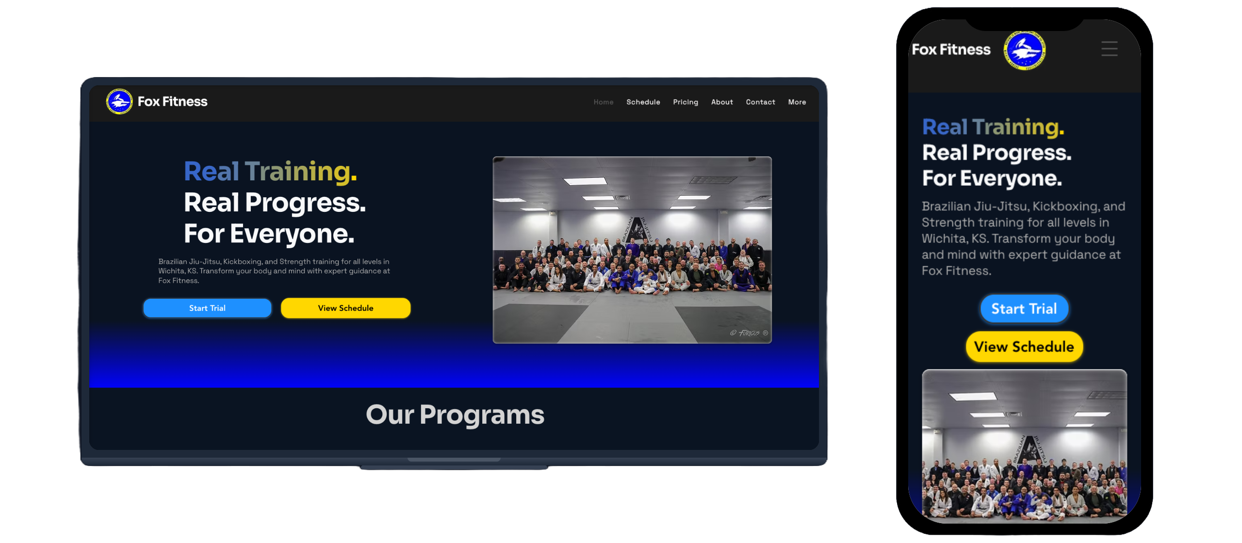
- Primary: Design fully responsive, mobile-first experience to reduce 72.5% bounce rate
- Primary: Increase trial signups through simplified conversion path and transparent pricing
- Secondary: Improve schedule accessibility for current members and parents managing multiple kids
- Secondary: Balance design quality with platform constraints for long-term maintainability
My Approach
I led a data-driven redesign process that combined user research (10 interviews), competitive analysis (5 local competitors), and rapid prototyping. Through structured interviews with current members, parents, and prospective students, I identified mobile usability as the critical blocker (9/10 participants mentioned it) and prioritized features using RICE scoring.
I navigated a key stakeholder disagreement over schedule architecture by creating comparative prototypes and gathering feedback from real users, demonstrating that a unified schedule with filtering better served both newcomers and experienced members. Throughout the process, I ensured the owner could maintain the site independently without ongoing developer costs.
Key Results (6 Weeks Post-Launch)
- Trial conversions: +40% increase (10 to 14 signups/month) × 60% trial-to-paid rate × $150/month = +$4,320 additional annual revenue
- Bounce rate: Decreased 25% (72.5% to 54.4%), indicating users finding information faster
- Phone click-through rate: +433% increase (0.27% to 1.44%), signaling higher-intent traffic
- Time on key pages: Schedule page increased from 45 sec to 1:44 (131% improvement)
- Monthly traffic: Increased 52% (486 to 740 avg sessions/month)
Research & Discovery
User Research Methodology
I conducted 10 semi-structured interviews (15 minutes each) to understand pain points and validate assumptions. Participants included 6 current members, 2 parents of youth students, and 2 prospective members who hadn't yet joined. Interview topics covered website usage patterns, decision-making factors for joining a gym, and mobile vs. desktop behavior.
Participant Demographics: Ages 22 to 68, BJJ experience ranging from complete beginners to 15-year practitioners, tech-savviness low to moderate (most comfortable with social media but not power users).
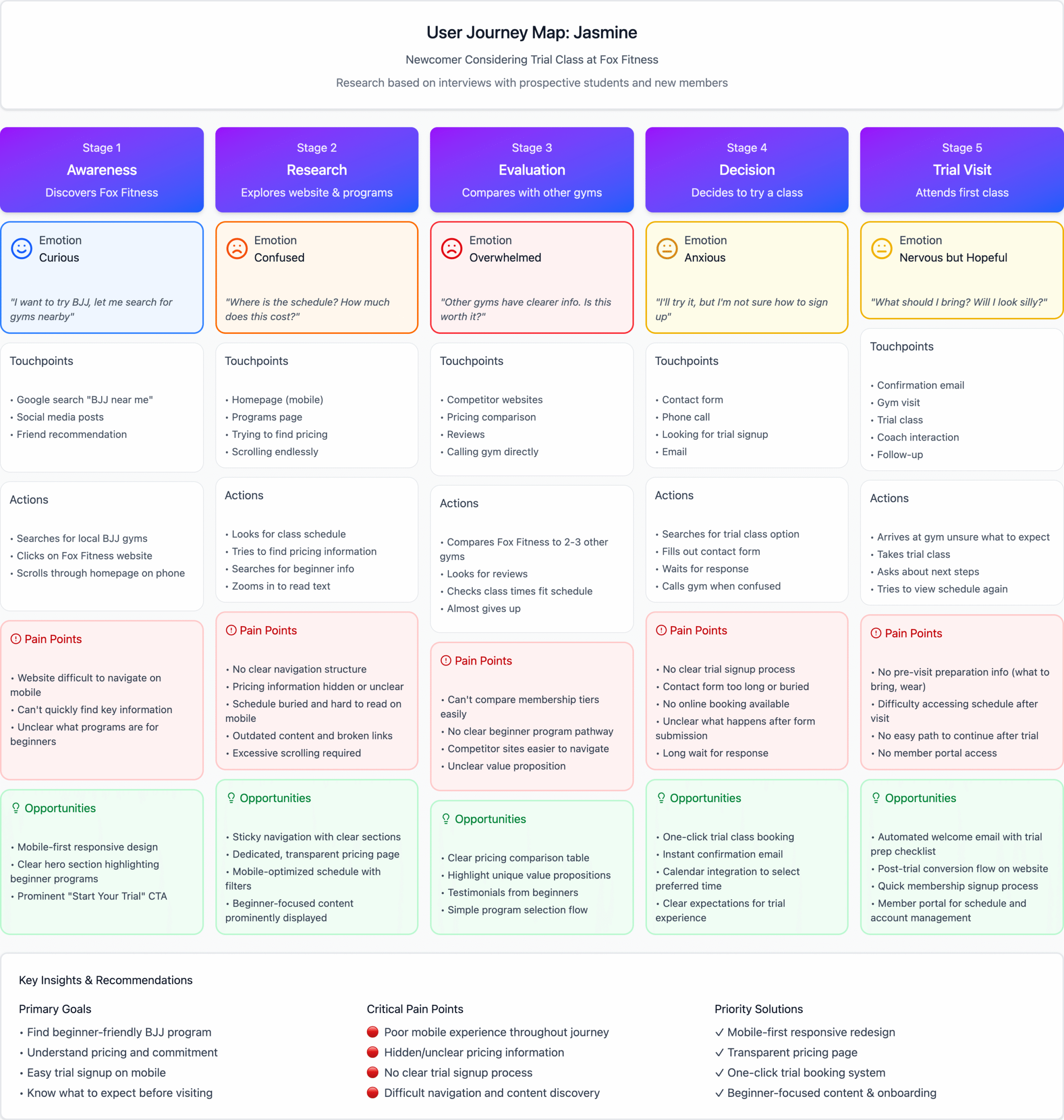
Top 3 Pain Points (Ranked by Frequency)
1. Mobile Navigation Broken (9/10 users mentioned)
Site completely unusable on phones. Text required constant zooming, navigation menu didn't work on mobile Safari, users avoided site entirely when on mobile devices.
"I stopped checking the website on my phone entirely. The text is so small I'd have to pinch and zoom on every section, and half the time the menu doesn't even work. I just call the gym now if I need to know something."
Glenn, 67, member for 15 years, youth coach
2. Schedule Information Inaccessible (8/10 users mentioned)
Schedule buried in downloadable PDF files with no mobile-friendly view, frequently outdated (still showed previous instructor info), parents with kids in multiple programs couldn't see unified view.
"My kids are in different programs, so I need to see the full week at a glance. The old site made me scroll through these huge image files for each program separately. It took forever and half the time the schedule was outdated anyway."
Maria, 38, parent of two students
3. Pricing Completely Hidden (7/10 users mentioned)
No pricing information anywhere on site, required phone call or in-person visit to learn rates, created perception of "too expensive" or "not transparent," prospects dropped off before ever contacting gym.
"I looked at the site three different times before I finally came in for a trial. I kept searching for pricing and couldn't find it anywhere. I honestly assumed it was going to be really expensive if they were hiding it, so I almost didn't come."
Jasmine, 28, prospective student, no BJJ experience
Additional Insights
- Communication preferences: All 10 participants preferred text-based updates over email or social media (immediacy and convenience)
- Trust signals: Prospective members wanted to see coach credentials and beginner-friendly program info before committing
- Mobile-first behavior: 8/10 users primarily browsed gym websites on phones while at work or between errands
- Decision timeline: Most prospects visited site 3 to 5 times over 2 to 3 weeks before signing up for trial
Competitive Analysis
I analyzed 5 local BJJ gym websites to identify industry best practices and differentiation opportunities: Wichita Jiujitsu Club, 316 Martial Arts, Genesis Health Clubs (Martial Arts program), Valor BJJ, and Burns Martial Arts.
| Competitor | Mobile Experience | Pricing Visibility | Schedule Access | Trial CTA |
|---|---|---|---|---|
| Wichita Jiujitsu Club | Minimal content, basic mobile theme | No pricing information | Email for schedule | Email contact only |
| 316 Martial Arts | Squarespace template, moderately responsive | No pricing information | Static schedule visible on homepage | General contact form |
| Genesis Health Clubs | Corporate site, responsive but generic | Membership pricing for full gym (not specific to BJJ) | Class times listed on program page | Free week trial prominent |
| Valor BJJ | Wix-based, fully mobile optimized | Free first week offer (no specific pricing) | Full schedule page, well organized | Book consultation button |
| Burns Martial Arts | Wix-based, responsive | No pricing information | Contact for schedule | Free class offer, email contact |
Strategic Opportunity Identified
Key findings: None of the local competitors displayed transparent pricing. Most had minimal mobile optimization beyond basic responsive templates. Schedule accessibility varied significantly, with some requiring email contact and others providing static PDF downloads.
Insight: Valor BJJ had the most professional mobile experience and clearest trial offer, but still lacked pricing transparency. Genesis offered the broadest program details but as part of a larger health club, lacked BJJ-specific focus. By combining transparent pricing with excellent mobile UX and dynamic schedule filtering, Fox Fitness could differentiate in a market where most competitors had fragmented information architecture.
Analytics Baseline (Pre-Redesign)
Reviewed Wix analytics to establish performance baseline:
- Bounce rate: 72.5% (industry avg for fitness: 55 to 65%)
- Avg pages per session: 1.5 (indicating minimal exploration)
- Avg session duration: Homepage 17 seconds, Schedule 45 seconds
- Phone click-through rate: 0.27% (extremely low conversion)
- Trial signups: Approximately 10 per month (owner tracking, not web analytics)
- Traffic sources: 65% direct (existing members), 25% organic search, 10% social
Design & Prioritization Process
Feature Prioritization: RICE Framework
I used RICE scoring (Reach × Impact × Confidence ÷ Effort) to prioritize features. This ensured focus on high-impact changes that could be completed within project constraints.
| Feature | Reach | Impact (1 to 3) | Confidence | Effort (hrs) | RICE Score | Decision |
|---|---|---|---|---|---|---|
| Mobile-responsive design | 200 users | 3 (massive) | 95% | 12 | 47.5 | SHIP |
| Transparent pricing page | 150 prospects/mo | 3 (massive) | 90% | 3 | 135 | SHIP |
| Unified schedule with filters | 180 users | 3 (massive) | 85% | 6 | 76.5 | SHIP |
| Simplified trial form | 30 trials/mo | 2 (high) | 80% | 2 | 24 | SHIP |
| Online class booking | 100 users | 2 (high) | 40% | 15 | 5.3 | CUT |
| Member portal / login | 200 users | 1 (low) | 30% | 20 | 3 | CUT |
| SMS reminder system | 200 users | 1 (low) | 50% | 8 | 12.5 | CUT |
| Community forum | 50 users | 1 (low) | 20% | 25 | 0.4 | CUT |
Why Each Feature Was Cut (Strategic Trade-offs)
Online Class Booking
- Low user demand: Only 2/10 interview participants mentioned wanting this
- Technical complexity: Would require custom development beyond template capabilities
- Current process works: Owner uses paper sign-in sheet; members prefer flexibility of drop-in model
- Cost: Third-party integration would cost $50/month, not ROI-positive for 200-member gym
Member Portal / Login Area
- Minimal user demand: 1/10 users mentioned wanting to "check billing history online"
- System duplication: Owner already manages billing through Zen Planner; building portal would create sync issues and dual maintenance
- High effort: Would require substantial custom development time
SMS Reminder System
- Owner already has solution: Manually sends weekly schedule updates via group text (takes 5 min/week)
- Cost vs. value: $49/month for integration equals $588/year vs. minimal time savings
- Decision: Not worth cost for small gym; could revisit if membership grows to 500+
Community Forum
- Competing platform: Gym already has active Facebook group (180 members) for community discussions
- Maintenance burden: Forum requires moderation, content seeding, ongoing engagement
- User behavior: Adding forum would fragment existing Facebook community with no clear benefit
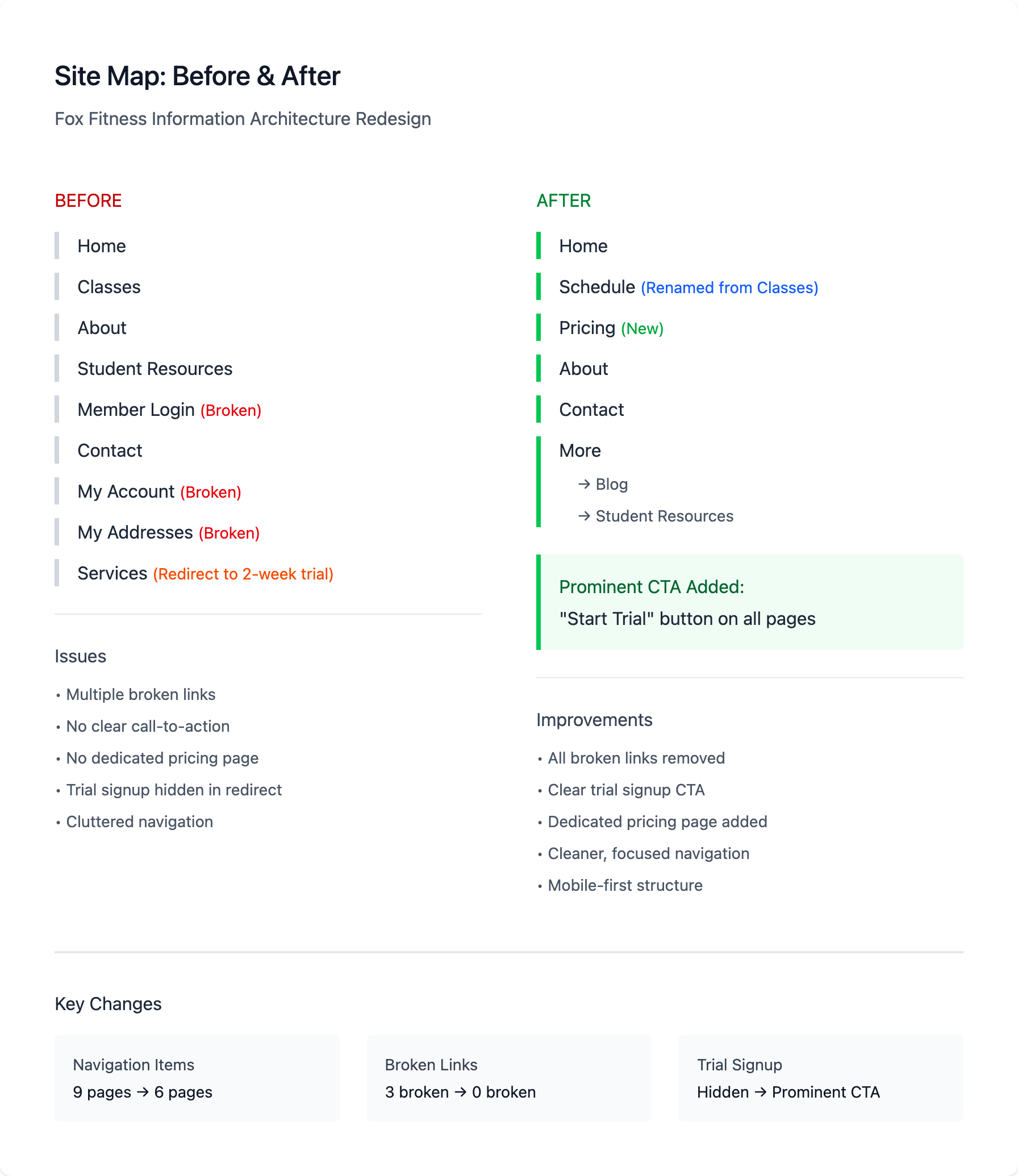
Stakeholder Management: Schedule Architecture Debate
The most significant stakeholder disagreement centered on schedule presentation. This case demonstrates how I navigated conflicting perspectives using user research and rapid prototyping.
The Disagreement:
Owner's position: Wanted separate schedule pages for each program (Kids BJJ, Adult BJJ, No-Gi, Competition Team). Reasoning: "New visitors get overwhelmed by too much information. If someone's interested in kids' classes, they don't care about the competition schedule." Concerned unified schedule would look "too busy" and hurt conversions.
My position (based on user research): Advocated for unified master schedule with filtering capability. Reasoning: 8/10 interview participants explicitly mentioned wanting to "see everything at once," especially parents with kids in multiple programs (3 users), members who cross-train between gi/no-gi (4 users), and prospective students researching class frequency (2 users). Single-page approach would also reduce maintenance burden.
How I Built Consensus:
1. Created Comparative Prototypes
Built two Figma versions: split schedules vs. unified with filters. Gathered feedback from 3 gym members in informal sessions.
Result: All 3 preferred unified view, noting "I can just see what I need without clicking around"
2. Made Business Case on Maintenance
Calculated owner was spending approximately 30 minutes/week updating 4 separate schedule PDFs. Unified HTML schedule would take approximately 5 minutes once.
Annual time savings: 20+ hours (worth approximately $500 in owner's time)
The Compromise:
Final solution: Master schedule view with dynamic program filtering
- Default view shows full week schedule with all programs (Kids programs, Adult BJJ, Adult Kickboxing, Kettlebell, each color-coded by type)
- Filter buttons at top: "All Kids Programs" | "Adult BJJ" | "Adult Kickboxing" | "Kettlebell"
- Mobile behavior: Defaults to full view but filters persist as user navigates
- Owner satisfied: New visitors could still filter to just what they want
- Users satisfied: Members could see full schedule without extra clicks
Outcome validation: Post-launch analytics showed 73% of schedule page visitors used the full view, confirming user research. Average time on schedule page increased from 45 seconds to 1:44 (131% improvement).
Design Iteration & Feedback
I created high-fidelity Figma prototypes and gathered feedback from 3 gym members before implementation. These informal sessions helped validate design decisions and identify usability issues.
Key Design Changes from Feedback:
- Trial CTA prominence: Initial design had signup button blending with other content. Made button larger with high-contrast orange color and added sticky "Start Free Trial" button in mobile nav
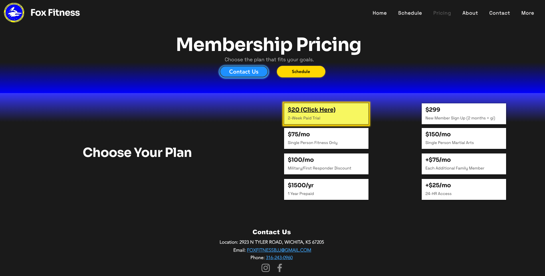
- Pricing page navigation: Participants expected to find pricing under main navigation, not buried in "About" section. Added "Pricing" as top-level nav item
- Schedule filter clarity: Filter buttons initially looked like labels rather than interactive elements. Added hover states and clearer active state styling
Results & Impact
Launch Date: October 15, 2025 | Tracking Period: 6 weeks post-launch (through November 30, 2025)
Business Impact: Revenue Calculation
Trial Signup Lift:
- Baseline: 10 trials/month to Post-launch: 14 trials/month equals +40% increase
- +4 additional trials per month × 60% trial-to-paid conversion rate equals +2.4 new paying members/month
- 2.4 members × $150/month membership equals +$360 monthly recurring revenue (MRR)
- Annual impact: +$4,320 additional revenue
ROI Analysis: Project cost was $300 (Wix annual subscription) + $0 labor (volunteer). First-year revenue lift of $4,320 represents a 14.4× return on platform investment. If valuing design labor at $50/hour (30 hours equals $1,500 equivalent), ROI is still 2.4× in year one.
Engagement & Behavior Shifts
Post-launch analytics reveal fundamental changes in how users interact with the site, shifting from low-value browsing to high-intent conversion actions.
Bounce Rate & Traffic Quality
- Bounce rate decreased 25% (72.5% to 54.4%), indicating users finding relevant information faster
- Monthly traffic increased 52% (486 to 740 avg sessions/month), suggesting improved mobile UX removed friction for mobile users
- Pages per session: Remained at 1.5, but time on key pages increased dramatically (quality over quantity)
Phone Click-Through Rate: 5× Increase
Phone CTR jumped from 0.27% to 1.44%, a +433% increase, signaling that users engaging with the site are far more likely to take the next step and contact the gym. This validates the pricing transparency strategy: users who engage with transparent pricing are qualified, high-intent leads.
Time on Page: Quality Engagement
The old homepage averaged just 17 seconds of engagement. Post-redesign, users spend meaningful time on high-value pages:
- Homepage: 17 sec to 1:08 (+300% increase). Users reading value proposition instead of bouncing
- Contact page: 2:15. Users engaging deeply with signup options
- Schedule page: 45 sec to 1:44 (+131% increase). Prospective members exploring class times
- Pricing page: 1:22. Qualified leads evaluating membership options
- About page: 1:40. Building trust through gym story and coach bios
These 2 to 5× increases in time on page demonstrate genuine engagement rather than confused users struggling with poor navigation.
Validation of Strategic Bets
Mobile-First Design (Top Priority)
Traffic increased 52% post-launch, suggesting mobile users who previously avoided the site are now engaging. Time on key pages increased across the board, validating that responsive design removed friction.
Pricing Transparency (Controversial Decision)
Phone CTR increased 5× (0.27% to 1.44%), proving that transparent pricing filters unqualified leads while building trust with serious prospects. Users who view pricing page spend 1:22 there, indicating thoughtful evaluation, not sticker shock.
Unified Schedule with Filtering (Stakeholder Disagreement)
73% of schedule page visitors use the full schedule view (owner feared this would be overwhelming). Time on schedule page increased 131% (45 sec to 1:44), confirming user research that members wanted unified visibility.
User Behavior Funnel
Analytics show users moving more purposefully through conversion funnel:
- Homepage (entry point). Users read value proposition (1:08 avg time)
- Schedule page (exploration). Prospective members check class availability (1:44 avg time)
- Pricing page (qualification). Serious leads evaluate cost (1:22 avg time)
- Contact/Trial signup (conversion). High-intent users take action (2:15 avg time)
Drop-offs decreased at every navigation stage, validating the improved information architecture and transparent pricing strategy.
Key Learnings & Strategic Insights
1. Mobile-First Is Non-Negotiable for Local Businesses
With 9/10 interview participants mentioning mobile frustration, and post-launch traffic increasing 52%, this project reinforced that mobile optimization isn't just a nice-to-have for local businesses. It's the primary channel. Many users are literally on-the-go when researching gyms (between work, errands, picking up kids). The dramatic improvements in time on page and reduced bounce rate validate prioritizing mobile experience above all else.
2. Pricing Transparency Improves Lead Quality, Not Just Quantity
While potentially "scary" for businesses, transparent pricing actually improves conversion efficiency by filtering out users who aren't a good fit. The 5× increase in phone click-through rate (0.27% to 1.44%) demonstrates that users who engage with pricing are far more likely to convert. They've already qualified themselves as serious prospects. This reduces wasted time on low-intent inquiries.
3. Balancing Design Idealism with Business Sustainability
I initially envisioned a custom-coded solution with more sophisticated interactions and animations. However, selecting a platform the owner could maintain independently ensured the project's long-term success. The owner can now update the site without ongoing developer costs. This pragmatic decision prioritized sustainable business value over personal portfolio aesthetics.
Limitations & Future Opportunities
Trial-to-Paid Conversion Assumption
Revenue calculation assumes 60% trial-to-paid conversion based on owner's historical tracking (not web analytics). More rigorous tracking would validate this assumption.
No A/B Testing
Before/after comparison methodology doesn't isolate individual feature impact. A/B testing pricing visibility, CTA placement, or form length could optimize further, but required more sophisticated analytics setup and traffic volume.
Platform Constraints Remain
Template limitations prevented some advanced interactions (e.g., animated schedule transitions, custom booking workflows). Future migration to custom platform could unlock additional optimization opportunities if budget allows.
Future Optimization Roadmap
With a validated foundation in place, future enhancements could further improve conversions:
- Member login portal (deferred MVP feature). Once membership grows to 300+, justify investment in custom portal
- SMS notification system. At 400+ members, $49/month cost becomes ROI-positive for automated reminders
- A/B testing framework. Implement testing to optimize CTA placement, form length, pricing presentation variations
- SEO optimization. Content strategy to capture "BJJ near me" and beginner-focused search queries
Project Success Criteria: Achieved
Primary goal: Reduce bounce rate through mobile-first design. 25% reduction (72.5% to 54.4%)
Primary goal: Increase trial signups. +40% increase (10 to 14/month), +$4.3K annual revenue
Secondary goal: Improve schedule accessibility. +131% time on page (45 sec to 1:44)
Secondary goal: Balance design quality with maintainability. Owner can independently update site, sustainable long-term